Website Design for a Medical Equipment Distributor
Medsure sells medical equipment to healthcare providers, who are themselves subject to regulatory audits. The site needed to establish compliance and credibility before addressing sales.
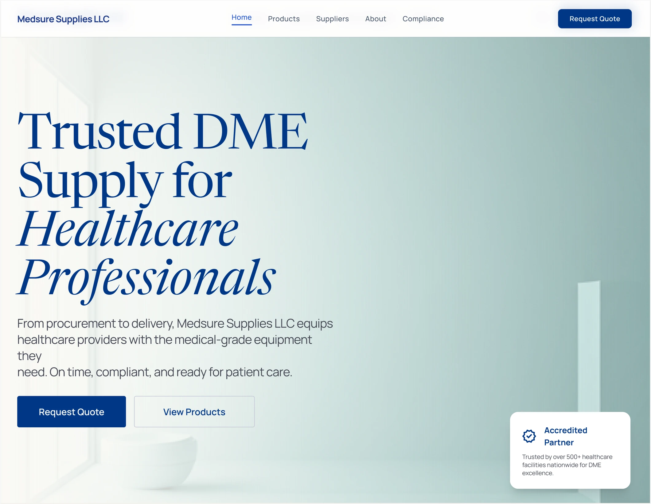
Medsure sells medical equipment to healthcare providers, who are themselves subject to regulatory audits. The site needed to establish compliance and credibility before addressing sales.
Overview
Medsure Supplies LLC distributes durable medical equipment, including wheelchairs, hospital beds, and other clinical hardware, to hospitals, clinics, and care homes.
I designed all seven pages of the site and built the front end in HTML, while a developer handled the backend.
The buyer's compliance needs shaped every decision. Because a provider's reimbursement claims depend on their supplier's accreditation, the site had to prove Medsure's compliance clearly. It works more like a verification resource than a typical sales page.
A DME distributor selling to healthcare providers across federal and state jurisdictions.
Seven pages of IA and UI, plus the front-end HTML, alongside a developer.
Buyers are audited. Every claim on the site has to be backed by a document someone can pull.
Launching now. The first of my projects to reach real users.
The buyer
The person using this site is not a typical shopper. They run procurement or clinical operations at a hospital, clinic, or care home, buying in volume and on contract. Like Medsure, they are themselves regulated.
This changes what the buyer needs from the site. When a provider bills for equipment, the supplier's paperwork becomes part of their own claim. If Medsure's accreditation has lapsed, the consequence falls on the buyer: a denied reimbursement or a failed audit.
As a result, buyers tend to ask questions in a different order than most product sites expect:
Is the supplier legitimate? Licensed, accredited, and in good standing, in my state.
Can that be verified with documentation? Not a claim on a page. A document with a number on it.
Will compliance still hold next quarter? Contracts outlive purchase orders.
Only then: what does Medsure sell, and at what cost?
The reframe
Most SaaS and tech sites lead with a trust bar: logos of companies they work with, before anyone reads the pitch. Medsure follows the same convention, but a client-logo strip wouldn't mean much to a hospital's procurement team.
What carries that same weight here is the certification itself, so HIPAA, CMS.gov, ACHC, FDA, and ISO 13485 fill the slot a logo strip would normally occupy.

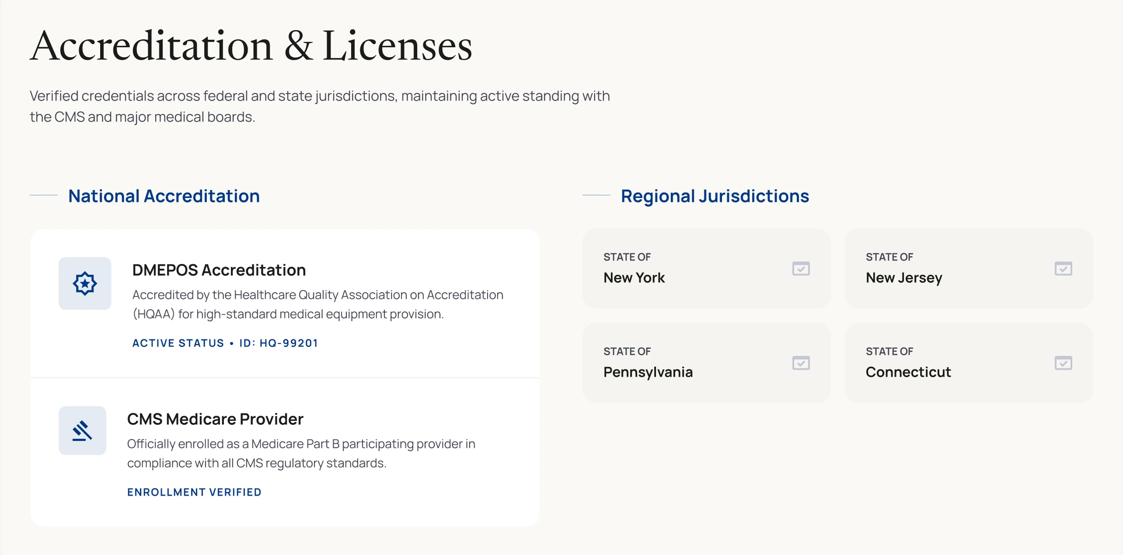
That same logic extends to the information architecture. Compliance sits as a top-level nav item alongside Products, rather than under About. It opens to a full page covering a HIPAA statement, DMEPOS accreditation, licenses by jurisdiction, and a downloadable documents section.
The documents section matters most. Buyers don't need to read a claim; they need a file they can keep on hand before an auditor asks for it. Making the documents downloadable turns the page into a functional resource rather than marketing copy.
The work
A compliance officer doesn't need to read the whole page. They need two things fast: confirmation that Medsure is licensed in their state, and a document they can save for their own records.
The documents section is built around the second need. Every file lists its size, so it reads as something you keep, not something you skim.
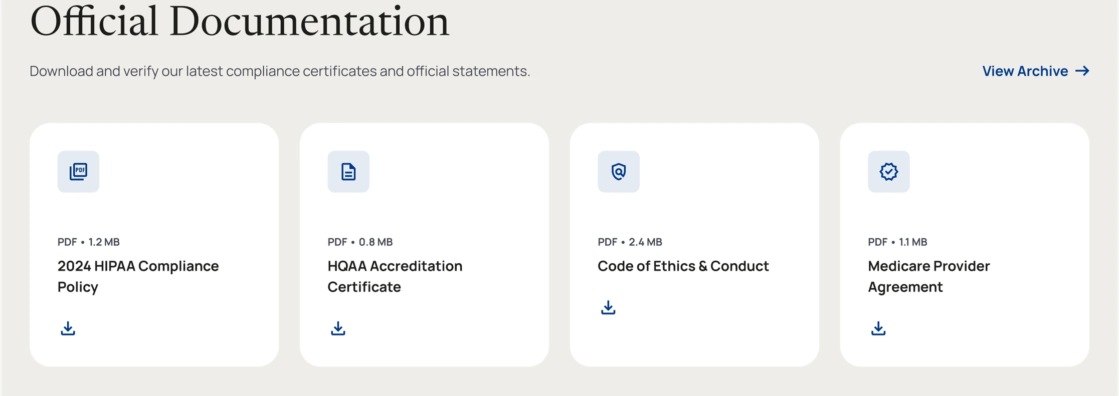
Buyers will eventually need to produce evidence about their supply chain, often to an auditor. Providing the documents before they're asked for costs nothing and is the most useful thing the site can do.
The catalogue
Procurement doesn't browse a catalogue the way a shopper browses a store. They search by clinical category, and once they've found what they need, everything downstream, a quote, a purchase order, references a SKU, not a product name.
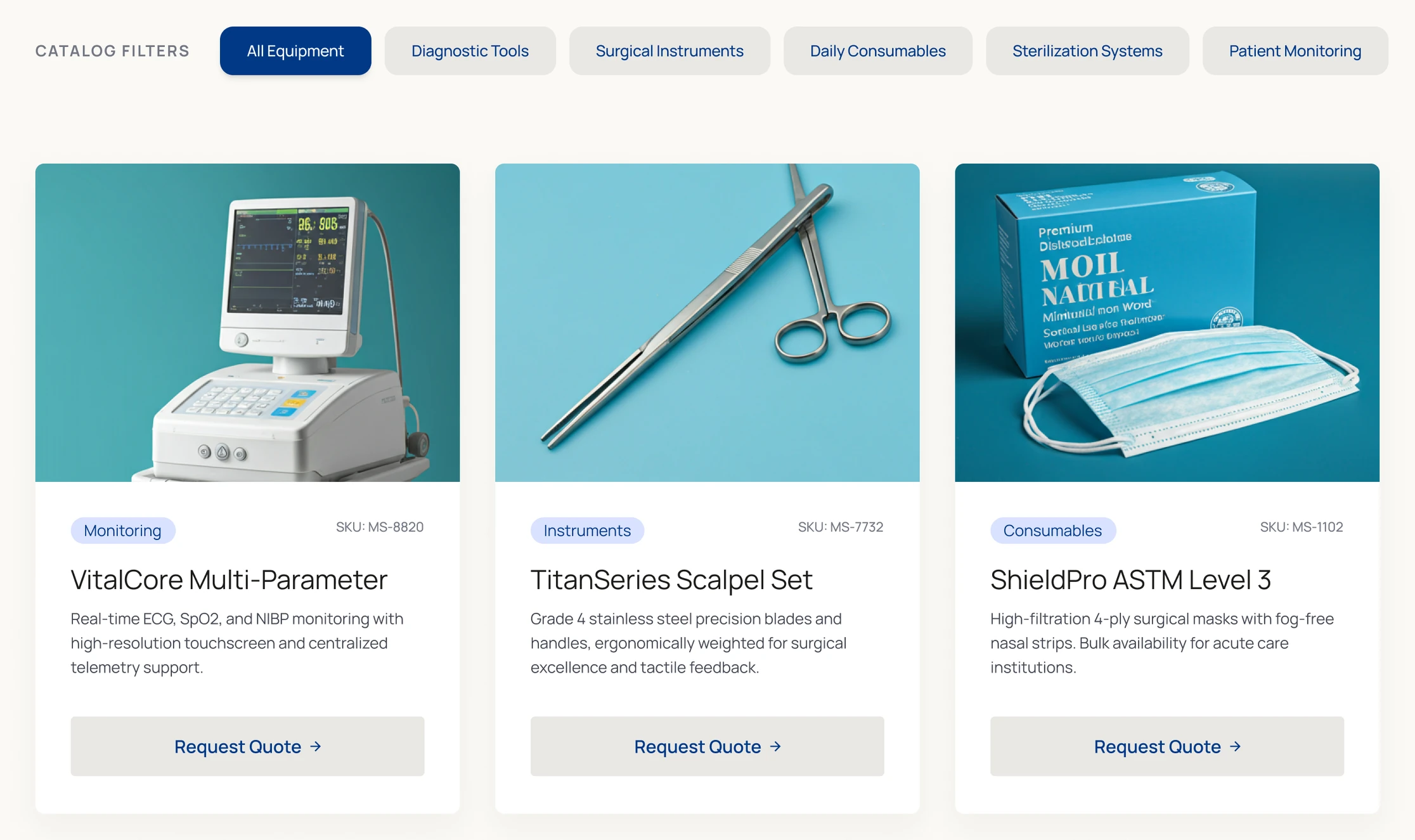
The catalogue is built around that search pattern. The primary action on every product is Request Quote rather than a price, since DME is bought on contract at a negotiated rate, and the full catalogue can be downloaded as a PDF for internal review before a purchase decision.
This one decision simplified the rest of the site. No cart means no checkout, no basket state, and no pricing logic, just a single path into a conversation with a person.
What's next
Nothing on this site has been tested with a real buyer yet. The reasoning behind each decision holds up on paper: credentials before products, SKUs over prose, no price on the catalogue. Whether it actually works only shows up when someone who does this job for a living sits down with the site. That's the next step before making any further changes.