Information Architecture for an AI Agent Platform
An enterprise AI platform had scattered everything users built across seven different screens. I redesigned it around a single, filesystem-based interface.
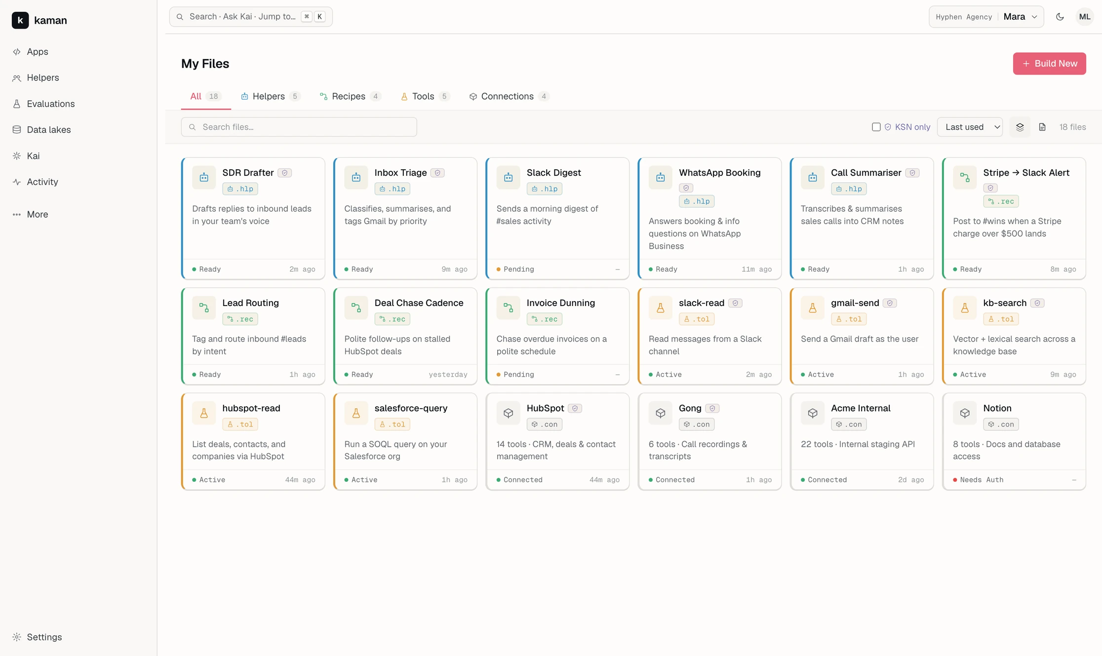
An enterprise AI platform had scattered everything users built across seven different screens. I redesigned it around a single, filesystem-based interface.
Overview
Kaman.ai lets teams build small, single-purpose AI agents instead of relying on one general-purpose model. The reasoning is that narrow agents are more accurate and cheaper to run.
Each agent does one job and connects to tools the team already uses. One example reads email and sends a summary to WhatsApp.
Because this approach produces a lot of small agents, my job was the screen where users manage all of them.
Everything a user built or connected was spread across seven separate destinations, or grouped into a single bucket called Uncategorized.
Redesigned the surface around a filesystem model, then built three working variations so the founder could compare them directly in a browser.
A documented rulebook I couldn't break. Eleven laws covering colour, language, state and disclosure, written before I arrived.
Prototype delivered to the founder. Not shipped, and not yet in front of users.
What I walked into
Most of Kaman's product direction was set before I arrived. These three constraints shaped every decision I made.
The platform's own assistant serves as the homepage. Users tell it what they want, and it builds alongside them. As a result, nobody arrives at this screen to browse. They arrive looking for something they already own.
An engineer wants tools, workflows, credentials, and data lakes. A shop owner wants the one helper that answers WhatsApp. The platform determines which type of user you are, so one screen has to serve both without a mode switch.
A documented rulebook governs color, language, disclosure, and state. Coral means act. Lavender means verified. These meanings are never mixed. I didn't invent a visual language here; I used an existing one.
The problem
The page listing a user's own work had stopped being navigable. The issue wasn't visual design, it was structure.
156 items in one bucket. Everything landed in a single group labeled Uncategorized.
Type was a visual detail, not a defining trait. The only distinction between an AI helper and a server connection was a small chip in the corner of a card. Two fundamentally different objects were rendered almost identically.
Things you made sat next to things you could make. Featured templates shared the page with a user's own work, so the page couldn't clearly answer either “what do I have?” or “what could I get?”
A grid layout, by default, at 150+ items. Cards work for browsing a handful of items. Past a certain count, they stop being scannable, with a Load More button standing in for real filtering.
Elsewhere, the opposite problem. Connections, Tools, Recipes, MCP servers, Apps, Helpers, and the Marketplace each had their own destination: seven places for things that, to the person who made them, are all just their stuff.
The reframe
A marketplace helps people find things strangers made. This page holds things you made and need to find again. Those are different jobs, and the page was built for the first one while serving people who needed the second.
People already have a mental model for organizing many items of different kinds that they need to locate later: files. I borrowed that model instead of inventing a new one. Every resource gets a file extension:
.hlpHelperan agent that does one job
.recRecipean automated workflow
.tolToola function a helper can call
.conConnectiona link to an outside service
The extension does what the corner chip couldn't. It sits next to the name, so type is read at the same moment as identity, and it gives every item a sort key. Repeated exposure also teaches the platform's vocabulary.
Once an item is treated as a file, the rest follows naturally: files live in folders, folders go in a sidebar, and files carry a type, a status, and a last-opened date.
The exploration
Everything was prototyped directly in HTML, using Claude Code to move quickly between variations.
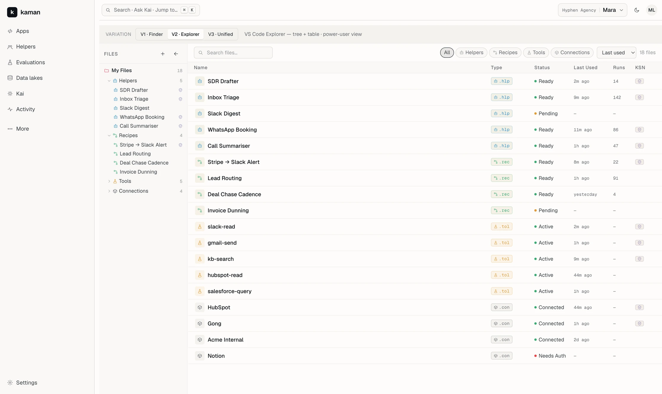
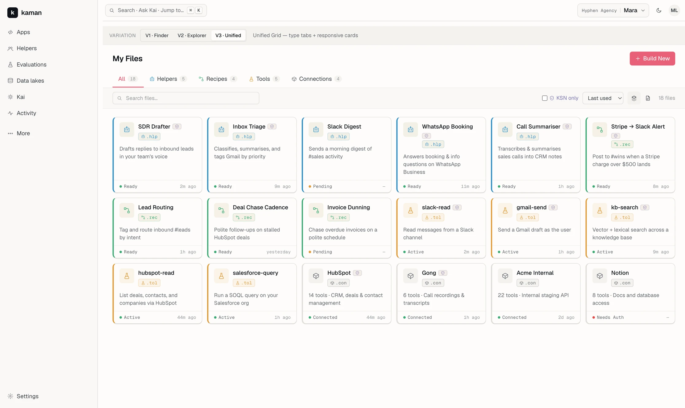
I built three complete, working versions of the same screen, wired to the same data, with a switcher at the top so the founder could flip between them directly. That switcher is visible in each screenshot below.
All three share the same search, sort, and filter state, so switching between them doesn't lose your place. This let us compare layouts directly, rather than whichever version happened to surface the item you cared about.
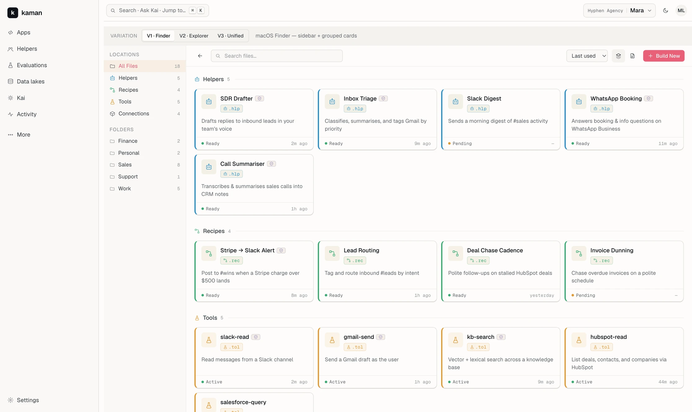
A sidebar lists Locations and Folders, with content grouped under type headings. Users land on everything they own, already sorted into groups, without choosing a filter first.
A collapsible tree beside a real table: Name, Type, Status, Last Used, Runs, KSN. Clicking a row opens a detail sheet instead of navigating away.
No sidebar at all. Type tabs across the top carrying their own counts, one toolbar beneath for search, sort, verified-only and grid or list.
The decision
V3 became the default, though not because it looked best. V1 and V2 both assume the user already knows what they're looking for. V3 is the only version legible to someone who has never heard the phrase “MCP server.”
V2 isn't a rejected draft. It's the right screen for an engineer managing 156 items who needs to sort by run count, and it's the only layout that holds up at that size.
The platform's existing rules already covered this: the system determines the user type and routes them to the matching view, without asking them to pick a mode. That rule applies to Kai, and it applies here too. Casual users get tabs and a grid. Power users get the tree and the table. Neither sees a toggle.
The deliverable became a pairing of two layouts rather than a single one.
The system
Four resource types needed four colors. Helpers are central to the platform, so coral seemed like the obvious choice. That would have been wrong.
Coral already means act. Lavender already means verified. The rulebook never mixes them, and a coral Helper card would have told every user that Helpers are a button.
So resource types use a separate palette instead: blue, green, amber, and a neutral tone for connections. On a full screen of cards, coral appears exactly once, on Build New. Lavender appears only on verified items. Type color remains a distinct, quieter signal.
What's next
The prototype is delivered, not shipped. Four things would move it forward.
No testing yet. So far this rests on my argument and the founder's judgement, which is enough to justify a direction but not to settle one.
The test: hand someone 156 files and ask them to find one connection. Time it. That number decides V2 against V3 better than either of us can.
The mock data holds eighteen files. The case is about what happens at a hundred and fifty, and at eighteen every layout looks fine.
The test: load a realistic set and see which one still holds. It's the fastest way to confirm the default, or change it.
The platform has thirteen kinds of resource. This covers four. Apps, knowledge bases, prompts and channels come next.
The test: they should slot in without a redesign. Borrowing a model people already know is what buys that, and it's worth proving rather than assuming.
My Files currently sits in an overflow menu, and only for the technical persona. It was placed where it fit during development, not where it belongs long term.
The argument: a filesystem only works if you'd stumble into it. This is the first change I'd push for.