Product Design for a Crypto Wallet and Payments App

Most crypto holders never spend their crypto, largely because doing so is inconvenient. For a fintech startup preparing for a Nasdaq listing, name withheld until then, I designed a wallet, card, and payments app intended to make spending crypto as simple as using a regular debit card.

Company
Fintech startup, name withheld
Role
Product Designer
Timeline
Since May 2026
Scope
Research, IA, UX, UI, design system
Consumer
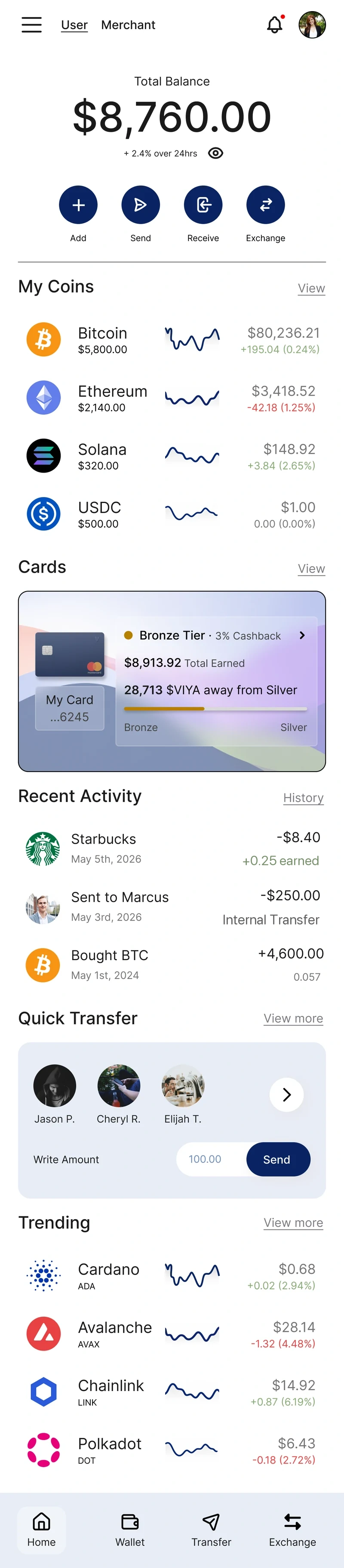
Consumer home screen: total balance of $8,760.00, quick actions for Add, Send, Receive and Exchange, a My Coins list, and the card tier progress toward Silver.
Merchant
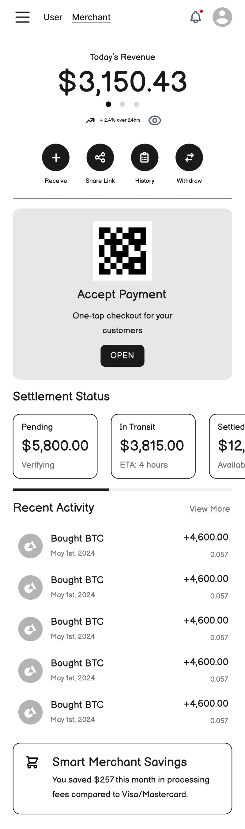
Merchant home screen: today's revenue of $3,150.43, quick actions for Receive, Share Link, History and Withdraw, an Accept Payment QR card, and settlement status.

Overview

Three products, unified by one design goal.

This is a client project for a fintech startup building three products at once: a crypto wallet, international remittance, and merchant payments, tied together by a debit card and a rewards program. The company has asked not to be named here, ahead of a planned Nasdaq listing, so this case study describes the product without identifying the business.

The founder brought me in to design the customer experience around a simple belief: crypto adoption isn't limited by the technology, it's limited by how inconvenient crypto is to spend day to day, so most people just hold it instead. His brief, almost word for word: users “don't have to really worry whether it is crypto or fiat.”

The goal wasn't to make crypto easier to understand. It was to make the underlying technology disappear, behind a card that taps like any other.

The problem

Crypto is easy to buy and painful to spend. That gap, not the technology, is where adoption stalls.

What I did

Competitor teardown, three personas and journey maps, full IA and flows, a design system, and hi-fi dashboards for both consumer and merchant.

Status

Delivered to the founder, who responded positively and is considering the direction for future builds. Hi-fi build in progress.
The problem

Buying crypto is easy. Spending it isn't.

Buying crypto takes about ninety seconds. Spending it requires converting to cash, waiting for it to settle, and paying a fee before making a purchase. Each extra step gives people a reason to use a credit card instead.

The typical industry response is to close that gap with education: explainers, tutorials, glossaries. This founder took the opposite approach: stop explaining the technology and hide it instead.

“We cannot go on educating everybody. But if you say that we are going to give you a card, then it's much easier, because [everybody is already using] a card.”

From an early call on the concept

Research

Three products, three distinct user types.

Designing for a single generic “crypto user” would have failed all three products at once, so I built one persona per product. Each has needs the other two don't share.

Wallet & card

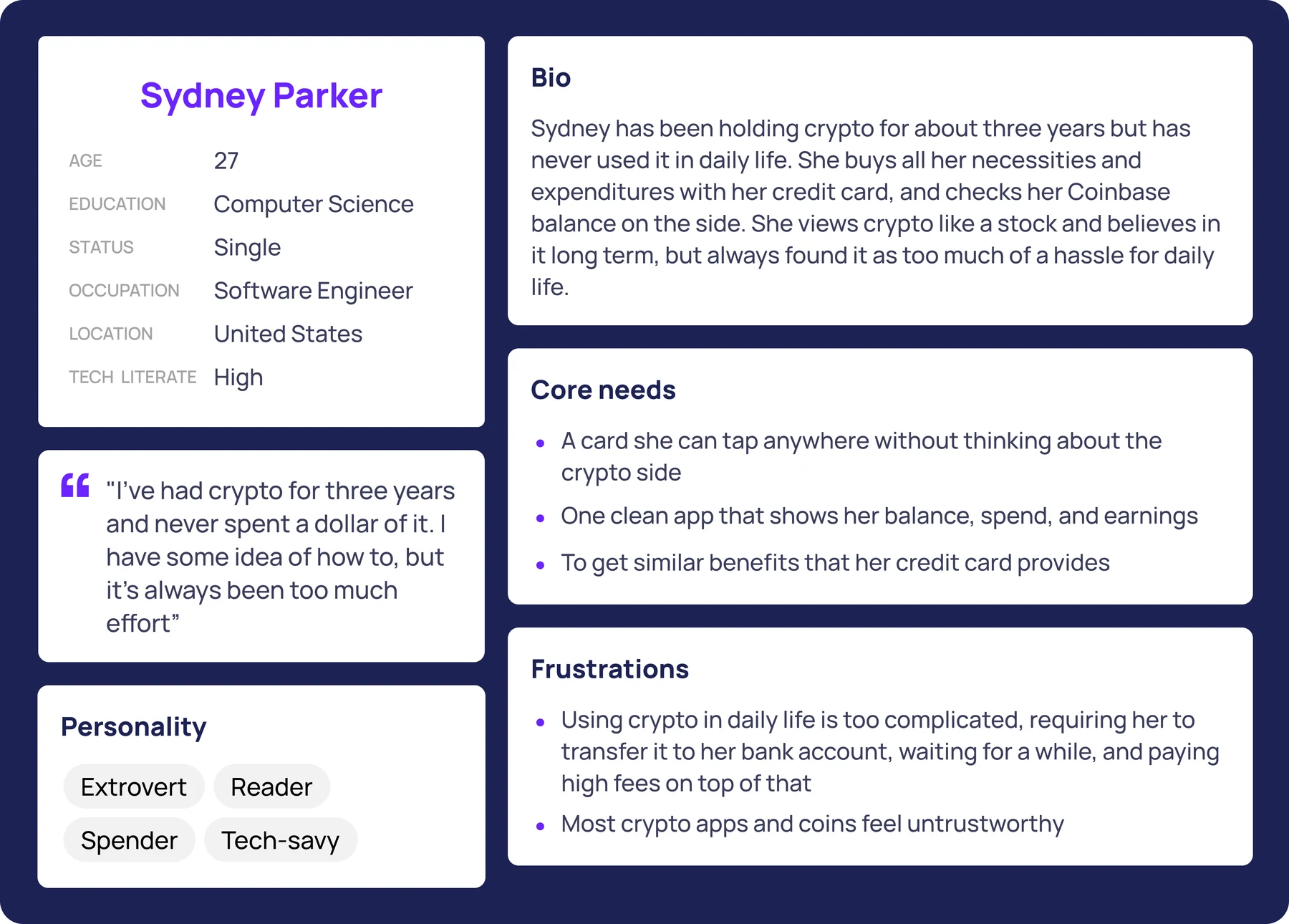
Sydney Parker

27, software engineer

“I've had crypto for three years and never spent a dollar of it. I have some idea of how to, but it's always been too much effort.”

Needs: a card she can tap anywhere without thinking about the crypto side, and rewards that beat what she already gets.

Remittance

Amir Patel

34, healthcare professional

“I've built a stable life here and manage my finances well. The one thing I can't fix is how much disappears every time I send money home.”

Needs: honest exchange rates, predictable arrival times, and an app simple enough for his family abroad to actually use.

Merchant

Daniel Osei

42, restaurant owner

“I want to accept crypto, I just don't have time to figure it all out.”

Needs: Square level simplicity, lower fees than card processors, and protection from volatility hitting his revenue.

Full persona artifact for Sydney Parker, showing demographics, a bio, a representative quote, personality traits, core needs and frustrations.
One of three personas. These are based on assumptions drawn from market research and competitor reviews rather than interviews, a limitation addressed at the end.
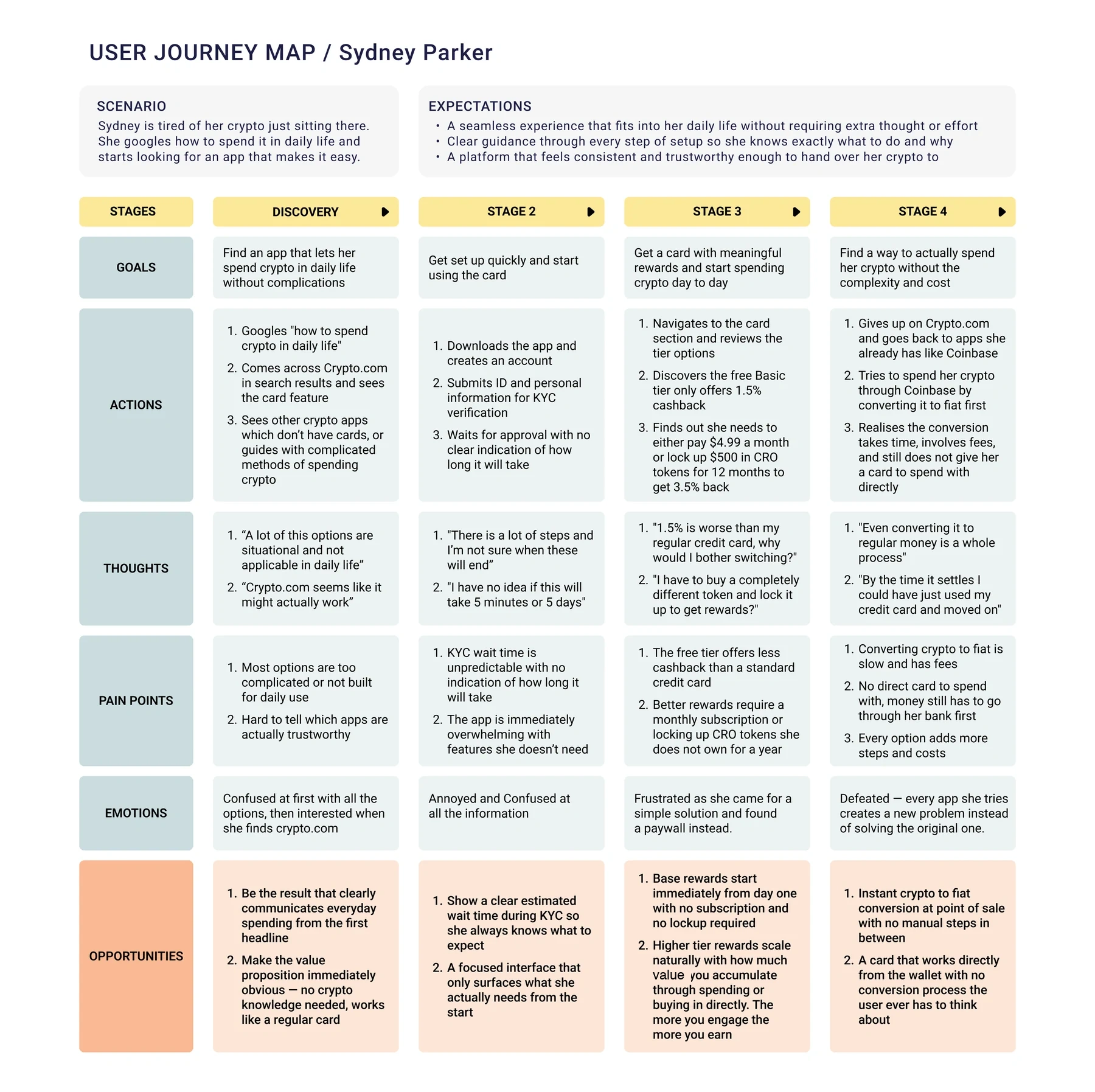
Sydney Parker's journey map across four stages: discovery, setup, evaluating the card, and giving up. Each stage lists goals, actions, thoughts, pain points, emotions and opportunities.
Sydney's journey map. Mapping her experience against the market leader surfaced the opportunity the product needed to address.

The insight

The market leader requires an upfront investment for rewards.

Following Sydney through Crypto.com, the largest competitor in the category, her journey broke down at one specific point: the rewards system. She wanted to spend crypto and hit a paywall instead.

“1.5% is worse than my regular credit card, why would I bother switching? I have to buy a completely different token and lock it up to get rewards?”

Sydney's journey map, evaluation stage

This is the core opportunity. The incumbent asks users to invest before rewarding them. This product reverses that order.

The incumbent

  • Free tier pays less than a normal credit card
  • Better rewards need a monthly subscription
  • Or locking up $500 in a token you don't own, for 12 months
  • You invest first, and get rewarded later

Us

  • Rewards from the first purchase, no setup
  • No subscription, ever
  • No lockup. Spending is what earns you rewards
  • Tiers rise as you accumulate, so using it is the unlock

Principles

Three principles behind every screen.

The founder gave two instructions that pull in different directions: he wanted the rewards system to feel like a game, but also didn't want anyone to feel overwhelmed. Balancing both became the core design problem.

01

Make the crypto invisible

No wallet addresses, gas fees, or jargon appear on any primary screen. Balances lead in dollars. The app should read as a premium banking product that happens to run on crypto, closer to Revolut than to a trading platform.

02

A game, not a spreadsheet

Progress has to be visible and specific: not a vague percentage, but “28,713 points away from Silver,” an exact, reachable number. The reward is gamified, never the money itself.

03

Earn trust by showing the cost

Every fee and arrival time appears on screen before the user commits, not after. In a category people already distrust, transparency is the feature. Hiding the crypto can never mean hiding the price.

The work

The consumer home screen, redesigned around one question.

The consumer home screen is where the core thesis had to hold up. Every crypto instinct pushes toward charts and tickers, but Sydney just wants to know what she has, what she spent, and what she earned.

The consumer home screen, annotated with five numbered callouts. 1 2 3 4 5
1

One app, two people

Onboarding asks whether you're here to spend or to get paid, and that answer sets your default home. The toggle stays, so a shop owner who is also a customer never needs a second account.

2

Dollars lead. Always.

The largest number on the screen is a dollar figure, not a token count or portfolio allocation. This single decision reflects the core thesis: if the first thing a user reads is crypto, the app has already failed.

3

Four taps cover every money action

Add, Send, Receive, Exchange. Anything a person actually does with money is one tap from open, which is the standard set by the banking apps people already trust, not by exchanges.

4

An exact number, not a vague bar

The card shows how far she is from the next tier as a real figure she can act on, rather than a percentage. Specificity is what makes the next milestone feel reachable instead of abstract, and it's where the gamification lives without shouting.

5

Repeat sends, without going anywhere

Most transfers go to the same few people. Recent recipients sit on the home screen with an amount field, so the common case never becomes a flow.

The work

The same app, rebuilt around a different question.

Daniel doesn't have a portfolio. He has a restaurant. His home screen answers one question, which is how much came in and when it lands in the bank.

The merchant home screen, annotated with four numbered callouts. 1 2 3 4
1

Revenue, not holdings

The hero number is today's takings. Same layout as the consumer view, completely different meaning, which keeps one design system serving two mental models.

2

A QR big enough to read across a counter

Accept Payment is the largest tappable thing on the screen. Daniel's benchmark isn't a crypto app, it's Square, so taking a payment has to be one tap from open.

3

Where the money is, at a glance

Pending, In Transit, and Settled, each with an amount and an ETA. His deepest fear about crypto is money going somewhere he can't see, so the fix is to never make him ask.

4

A reason to stay, every month

A running total of what he saved on processing fees versus the card networks. His pain is margins, so the app quietly reminds him it's fixing exactly that.

The flows

The remaining flows, resolved in wireframe.

The home screens set the visual direction. The rest of the product was deliberately worked out in wireframes, so structure and sequence could be settled before visual design.

These are the flows as they stand today. They're mid fidelity on purpose, and they're being taken to hi-fi for the client now.

Onboarding

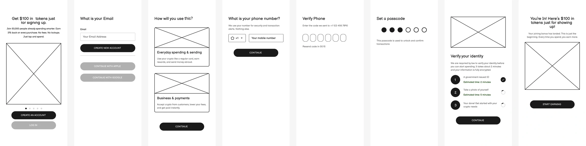
Onboarding wireframes: a primer screen offering a $100 signup bonus, email entry, a user-versus-business choice, phone verification, passcode setup, KYC with per-step time estimates, and a welcome bonus screen.
Two decisions carry this flow. The user-or-business question sets which product someone actually gets. And KYC, the step Sydney's research showed people abandon, states an estimated time next to every stage, because the pain there was never the wait, it was not knowing how long the wait would be.

Card and tiers

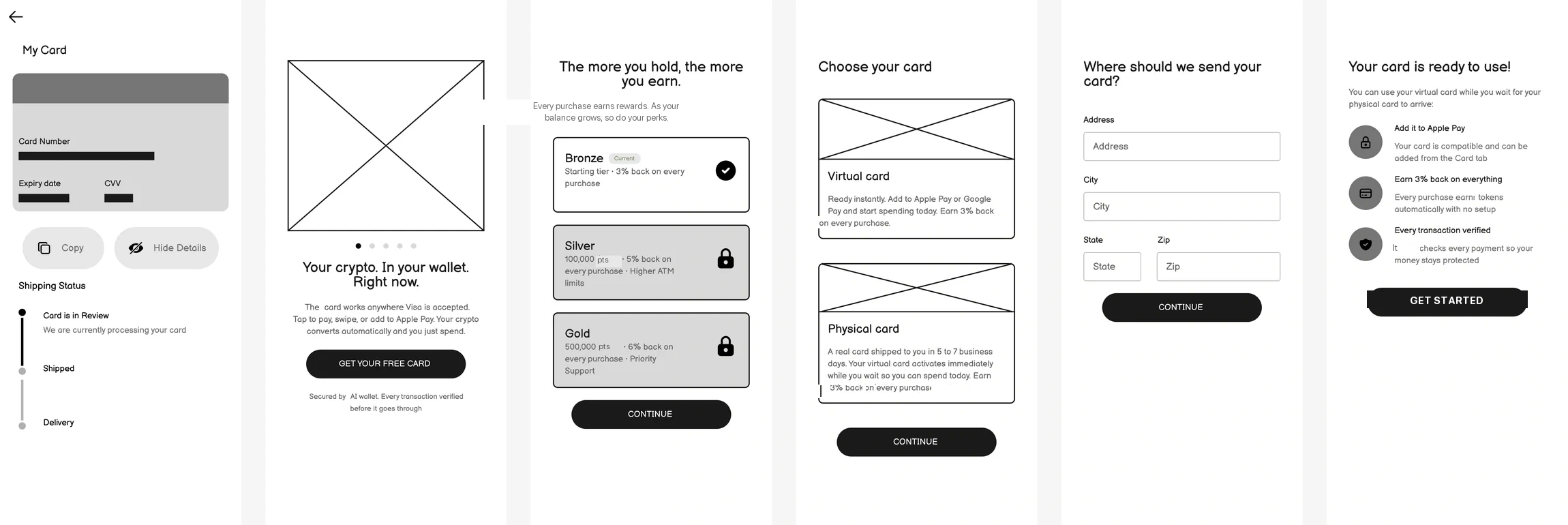
Card wireframes: a card sell screen, the three-tier ladder with Bronze current and Silver and Gold locked, virtual-versus-physical card choice, shipping address, and a card-ready confirmation.
The tier ladder shows locked tiers rather than hiding them, so the ceiling reads as a goal instead of a paywall. Bronze starts earning immediately, and the higher tiers unlock on rewards accumulated rather than money paid. This is the Crypto.com answer, made concrete.

Rewards

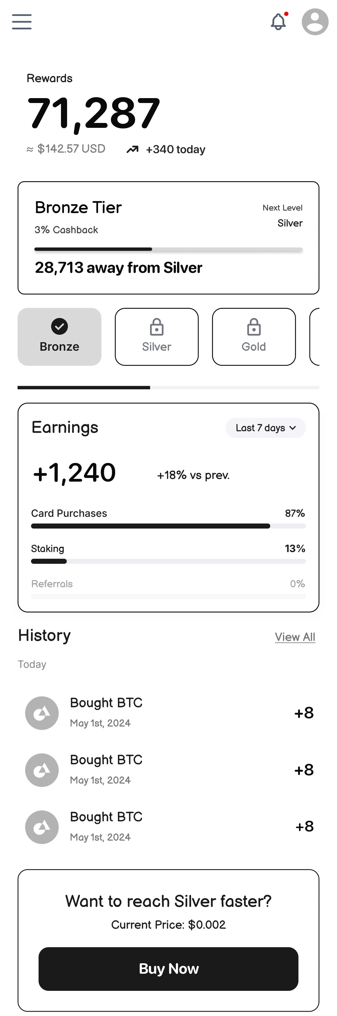
Rewards wireframe: a balance hero, current tier card with progress toward Silver, the tier ladder, an earnings breakdown by source, and earning history.
Where the gamification actually lives. The hero is the balance, the tier card states the exact gap to the next level, and the breakdown shows which behavior is paying off.

Transfer and remittance

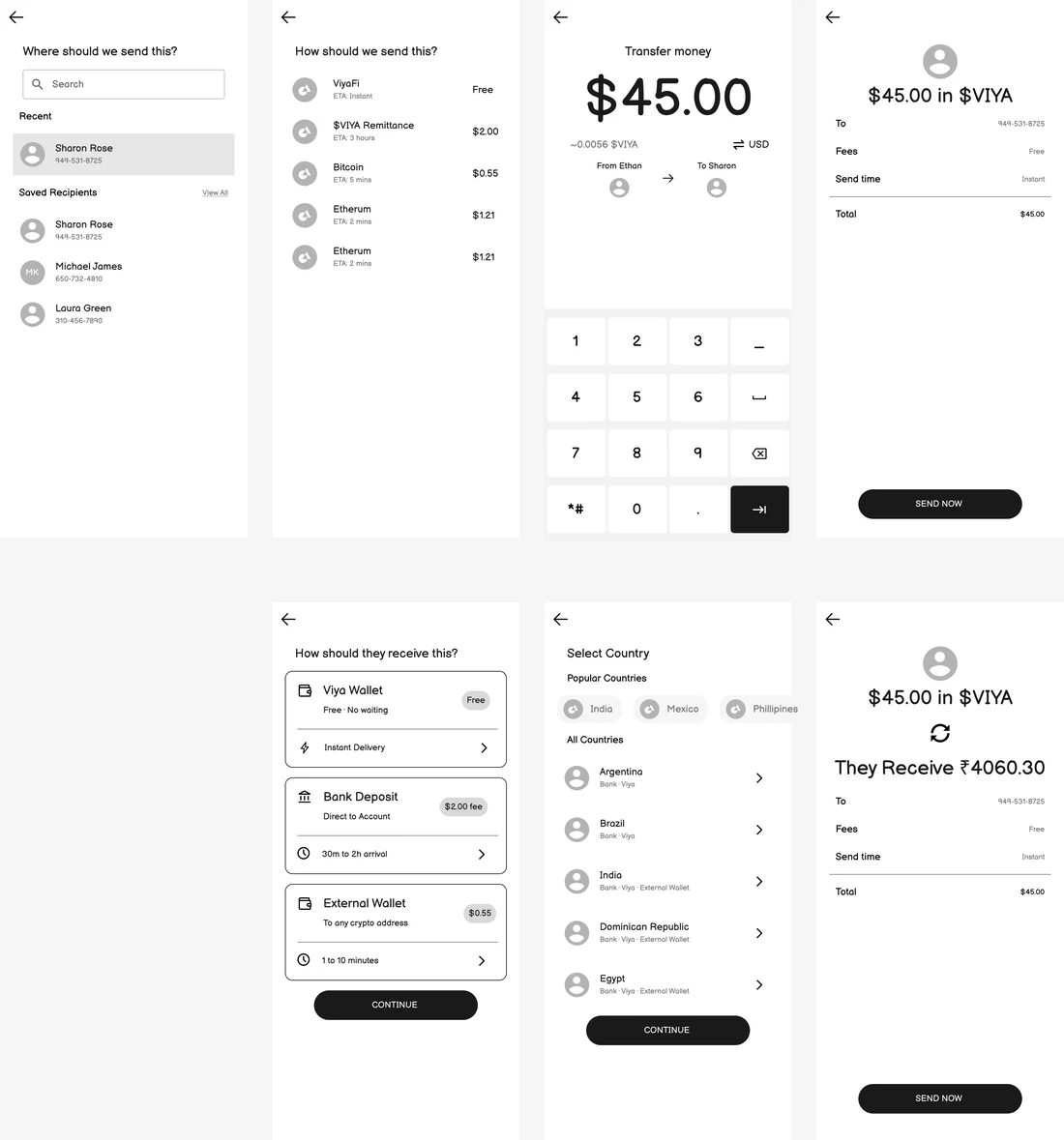
Transfer wireframes: choosing a recipient, choosing a send method with fees and ETAs listed, amount entry, review, delivery-method choice, country selection, and a remittance review showing the recipient's local currency total.
Amir's flow. No method can be chosen without its cost and timing already visible, and the remittance review makes the recipient's local-currency total the biggest thing there, because it's the only number he actually cares about.

What's next

What ships next.

This hasn't launched, so the usual proof isn't available yet. Three things would move it forward.

01

Make real personas. Sydney, Amir, and Daniel came from market research and competitor teardowns rather than interviews. The next step is five to seven interviews per pillar, weighted toward people who have already abandoned a crypto card.

02

Finish the hi-fi pass and build prototypes. Only the consumer and merchant surfaces are fully resolved today. The remaining flows still need to move from wireframe to hi-fi, along with working prototypes to test them.

03

Measure whether hiding it works, and test the prototypes. Nothing has shipped yet, so every claim here is a designed intention rather than a measured result. Once prototypes are ready, the key metric is the share of users who make a first purchase within seven days.